“Pink isn’t a color. It’s an attitude.”
Experts throughout the decades have tried to explain the importance and significance of color and how it affects consumer attitudes and behaviors. They cite psychological studies, global trends, new products and business forecasts. They look at fashion, the entertainment industry, food and beverage trends, politics and cultural mindsets, all in an attempt to communicate why color is important. But none of the experts have been able to articulate the role and effect of color in real life better than Miley Cyrus, who is quoted above.
Color has always been a powerful symbol – and a de facto language – used to communicate among peoples since the dawn of mankind.
The Significance of Color
But here’s the thing: color means different things to different people, depending on context, cultural upbringing, personal experiences, and yes, the design of consumer packaging. Popular infographics about color would have you believing that “red” means excitement and “blue” means competence. This oversimplification is amusing and seems right, but the science is iffy. And the meaning of a color can shift over time. Up until the turn of the last century, pink was the color for boys, and blue the color for girls. Consider the range of meanings and feelings evoked by the color pink 20 years ago, and compare them to today.
Color of the Year
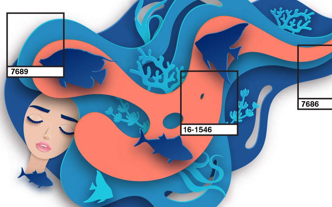
This all brings me to the declaration of “Living Coral” as the color of the year by the Pantone Color Institute. It’s pink, but with warm, soothing tones akin to the popular notion of what coral looks like. (Aquarists and snorkelers know better.)
In its announcement, Pantone stated that, “In reaction to the onslaught of digital technology and social media increasingly embedding into daily life, we are seeking authentic and immersive experiences that enable connection and intimacy. Sociable and spirited, the engaging nature of PANTONE 16-1546 Living Coral welcomes and encourages lighthearted activity.”
In other words, Living Coral is giving us all a group hug.

